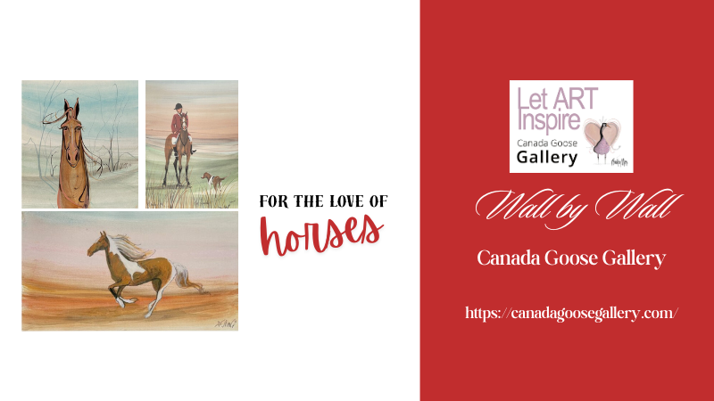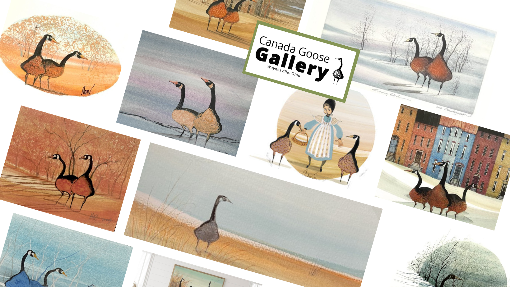
The Meaning Behind the Geese in P. Buckley Moss Art
There is something deeply moving about the Canada geese in P. Buckley Moss artwork. In her visual language, they are more than part of the landscape. They become symbols of loyalty, love, providence, and quiet watchfulness. Some feel romantic. Some feel peaceful. Some feel like home.
In this collection, each piece offers a different emotional note, from enduring partnership and gentle companionship to stillness, protection, and the calm beauty of a room shaped around meaningful art. As you look through them, notice which one speaks to you first and what feeling it brings with it.
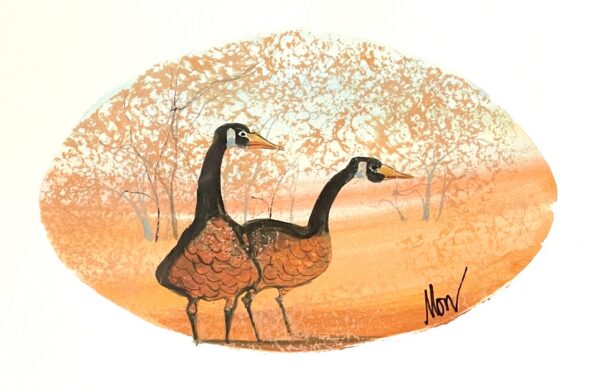
Forever Love
A devoted pair of geese stands together in a warm glowing landscape, turning this piece into a beautiful expression of lifelong partnership and enduring love. There is a quiet steadiness here that feels grounded and lasting, the kind of bond that does not need fanfare to be felt.
What relationship in your life does this kind of steady devotion remind you of?
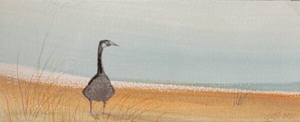
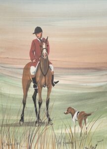
Goose On Shore Painting
A solitary goose stands at the water’s edge in a scene that feels peaceful, reflective, and quietly strong. This piece carries the kind of stillness that invites you to slow down and breathe. It feels self-possessed, calm, and untroubled by noise.
Does this piece speak to you more as a symbol of peace, independence, or inner calm?
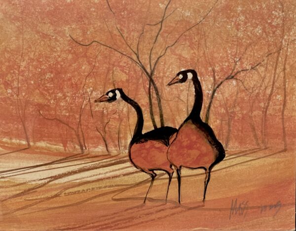
Geese Pair Painting
Set against a glowing autumn landscape, this graceful pair brings warmth, companionship, and the beauty of moving through life together. It feels rich with shared history, the kind of connection shaped over time and held through changing seasons.
What do you feel first when you look at this piece: love, comfort, or shared history?
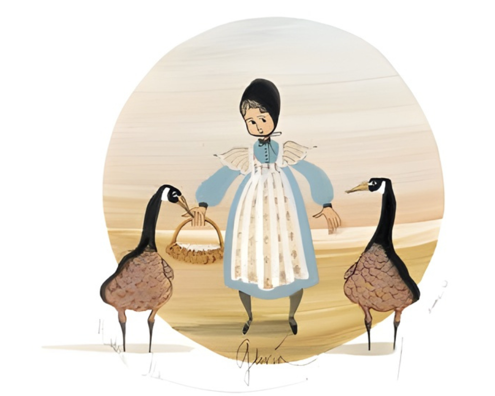
Gloria
A young girl stands between two geese in a scene filled with harmony, balance, and gentle companionship. There is innocence here, but also reassurance. The geese feel almost like quiet guardians, shaping the scene with tenderness rather than force.
Does this artwork make you think of innocence, protection, or the quiet comfort of connection?
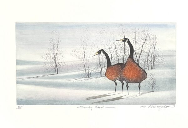
Evening Patrol
Two geese stand vigil in a snowy landscape, giving this piece a feeling of guardianship, loyalty, and calm at day’s end. It is a quiet kind of strength, not flashy, not loud, just present. The feeling is one of protection and companionship in the fading light.
Do you see this piece as watchful, protective, or reassuring?

Room Decor Spotlight: A Snowy Morning in the Valley Space
This serene living space shows how one panoramic artwork can become the calm focal point of a room, surrounded by soft neutrals, clean lines, and a restful sense of balance. It is a reminder that meaningful art does more than fill a wall. It changes the atmosphere of the room around it.
Could one meaningful piece like this change the entire mood of a room in your home?
What Do Geese Mean to You?
In P. Buckley Moss artwork, Canada geese seem to carry more than form and movement. They carry memory, partnership, stillness, and the comfort of being watched over. That is part of what makes them so lasting. They do not simply fill the scene. They hold it.
When you see geese in art, what feeling comes first for you: love, loyalty, home, peace, or protection?